Ever since the late 1990’s, when Ethan Zuckerman created the first pop-up (and eventually apologized for it), building a pop-up has been one of the leading ways to capture information or showcase advertisements.
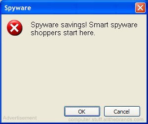
Zuckerman’s pop-up, created over 20 years ago, began as a grey, “traditional style” box, similar to the image below. It’s unsurprising that this nostalgic grey nuisance may make you want to grab a Polaroid and snap a shot of it, as they’ve evolved rapidly over the last several years. Or, even better, show your kids and see what they think of it.

The premise of a pop-up is to get the user to convert, and even on this basic pop-up, the user was prompted to hit the “OK” CTA as it was pre-selected and towards the middle of the box. While it may not be attractive, it proved incredibly effective.
What about now?
Almost 30 years later, we’re seeing some of the largest eCommerce giants continue to build pop-ups that haven’t evolved much from their predecessors. And before you go all “pop-ups cause bouncing visitors”, our friends at CXL shared some studies that reflect no change in the bounce rate, just 50% fewer email subscribers without a pop-up.
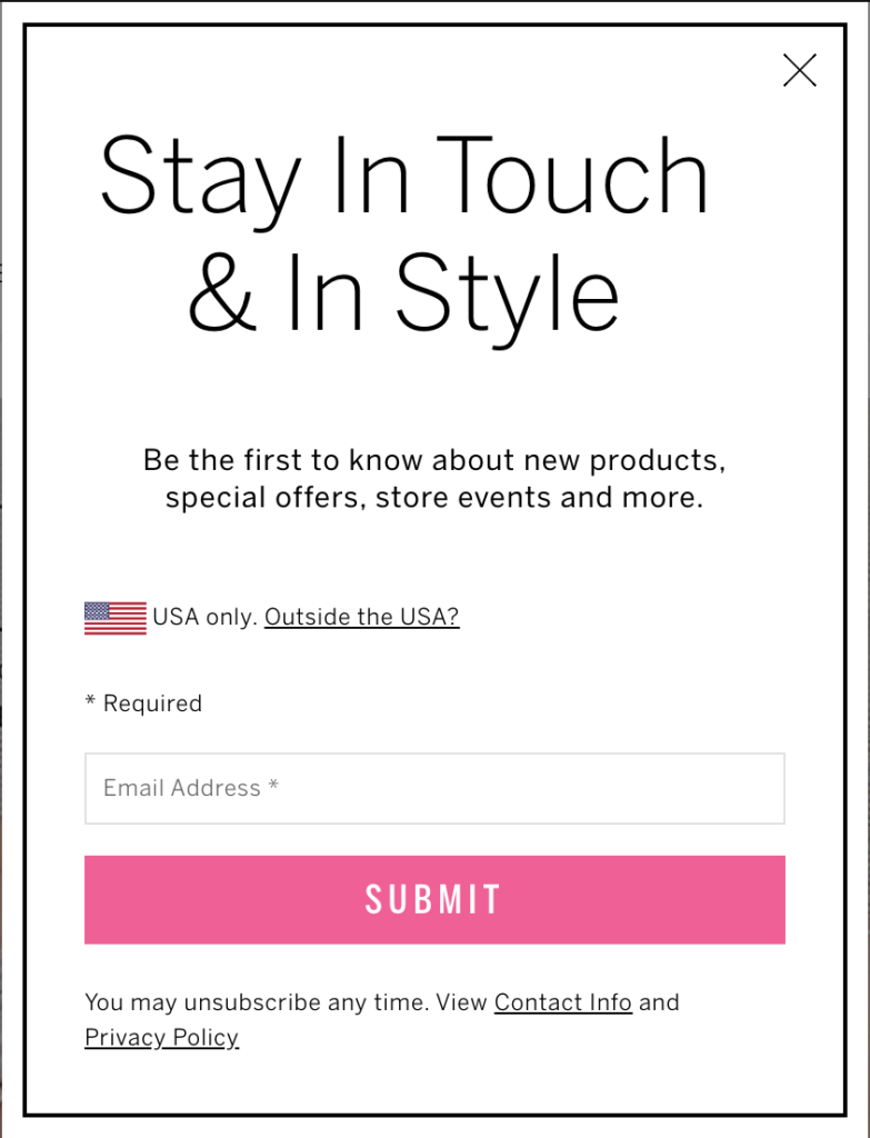
Let’s take a look at one modern example, and we’ll share some simple tactics to increase your conversion rates, start building your email lists and building a pop-up that is sure to convert.
Inadequate Pop-Ups = Conversion Funnel Roadblocks
You may be thinking “Well, it’s not too bad”, however, after reviewing this website’s SimilarWeb data, we found that the website who houses this pop-up sees roughly 32 million visitors a month!
Does that change your opinion?
Assuming this company is serving the pop-up to 60% of website visitors because they are marked as new visitors, roughly 19.2 million people are viewing it. Now, the average conversion rate of a pop-up, from both plug-ins and made in-house, hovers around a 1-3% conversion rate. Through personal experience in the pop-up industry, I would assume this graphic receives about a 2% conversion rate, simply because of the brand loyalty.

Next, let’s break down why this may be receiving lower-than-average conversion rates.
2 Reasons
- Graphically, there are some weird things going on here;
- The large American flag 🇺🇸 saying “USA only.” This, of course, deters any website visitors that are not from the US, but the company could use IP Geolocation to identify these consumers rather than asking them to identify themselves and take up valuable real estate on their pop-up.
- The unequal margins (I mean, really unequal) portray a certain level of negligence by the company when building the pop-up.
- The “* Required” in the middle of the pop-up is strange, as it shouldn’t be a focal piece of the ad. Instead, it should be moved to the bottom near the contact info and privacy policy. Or you could simply remove it in lieu of an error message when the submit button is clicked without a valid email address!
- The headline copy is nondescript;
- The header doesn’t ask a question, and also doesn’t offer an enticing incentive. You only have a split-second to capture a visitor’s interest, and excess or uninteresting copy will ultimately push a visitor to bounce. If you’re offering a sign-up for your newsletter, say it directly so a visitor can quickly decide whether or not they are interested, but also find something of value to trade them.
- Have an old video series sitting somewhere? Give it to them. Have a PDF guide you made last year? Give it to them!
P.S. Extra Tip;
I didn’t have to edit this pop-up to conceal the website where I found it. If you have a pop-up that doesn’t match your brand, doesn’t feel premium, and makes you feel “Handed-Off” to a third party, it’s unlikely many website visitors will convert on it. Always ensure you put your logo or name somewhere on the pop-up to maintain a consistent brand, and let your visitors know they are still on your website.


