You sit down, research, type, delete, type again, design, and finally create the perfect pop-up that will help you with email acquisition. And then it performs terribly. Why?
Viewers are getting tired of pop-ups
As digital marketers, while that’s disappointing, it’s something we need to acknowledge. Basic pop-ups asking for emails are simply becoming less and less effective. The average person views between 6,000 – 10,000 ads a day, according to an article from PPC Protect, many of these being served in pop-up form. It’s no wonder consumers have begun to tune out pop-ups and close out of them subconsciously without reading the copy.
Digital marketing, however, isn’t going anywhere. Instead, we must put on our creativity hats and decide how to make pop-ups effective once again.
1. Let’s not be selfish
One of the biggest mistakes you can make as a digital marketer is creating and offering content that is all about you and your company, rather than focusing on the consumer. By beginning with the action that you want viewers to take, you may misunderstand what they are looking for and are motivated by. Not only does your pop-up incentive need to be interesting to your audience, but it has to be more interesting than the action your pop-up just interrupted. For example, if your viewer clicked on a blog about taking care of plants, don’t serve them a pop-up about fish food. Instead, offer them an entire ebook about plant care which is likely going to motivate them to convert on your pop-up, because it’s relevant and valuable to the user based on their behavior.
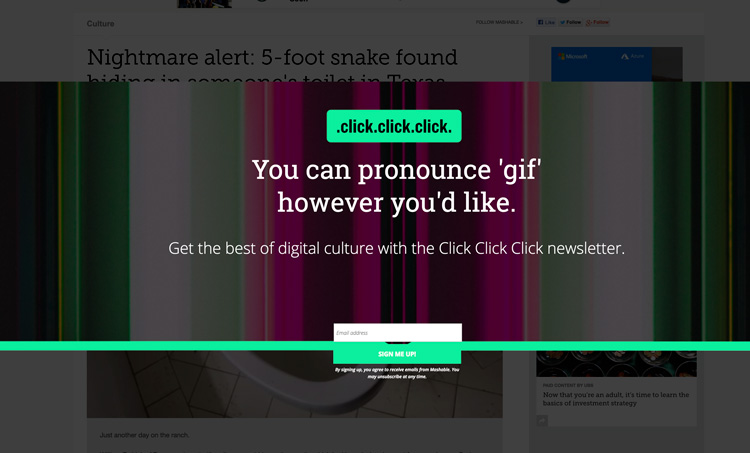
2. It's all about the experience
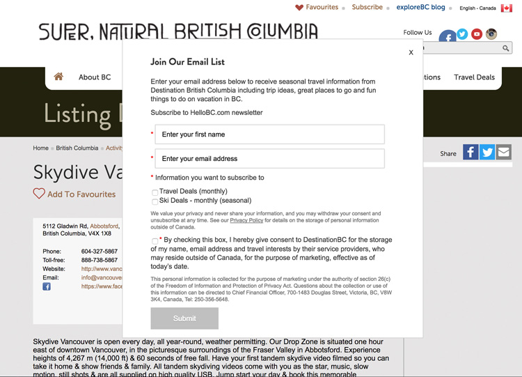
Consumers don’t want to be advertised to. They don’t want to feel like they were persuaded into a purchase, instead they want to think it was their idea (when in fact, it was yours). A simple, white box with black text pop-up is the best way to tell your audience exactly what you’re doing, advertising to them. Often, the only response you’re going to get from this is a roll of the eyes and hitting the X.
So what should you do?
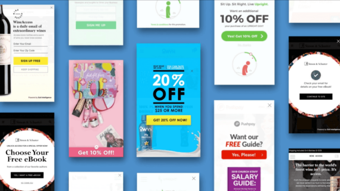
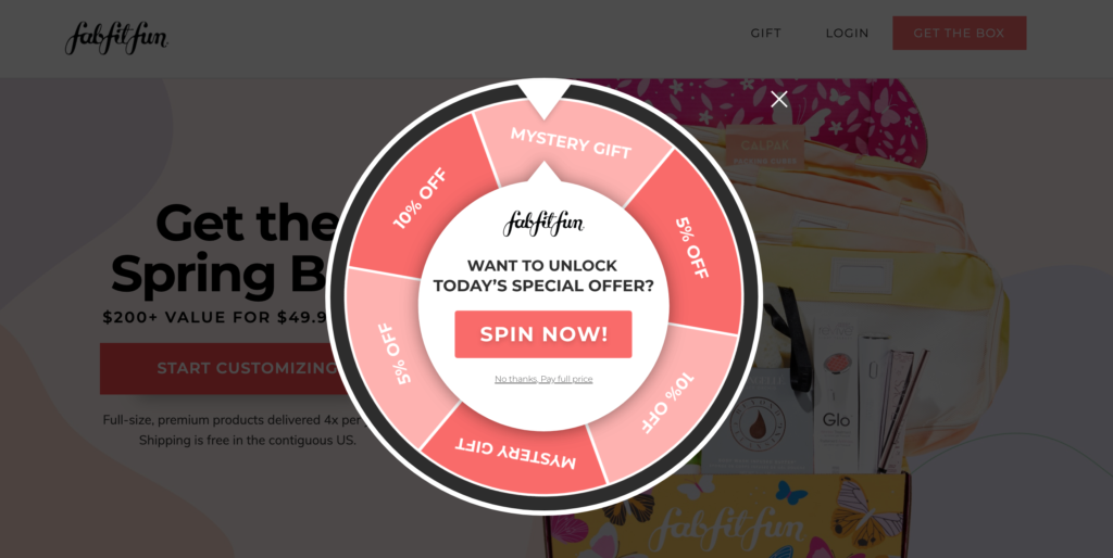
Well for starters, don’t blend in with everyone else. Email acquisition content designs need to be congruent with your brand and messaging, With User experience being key. Don’t make it obvious you’re selling, but design an ad for your audience that doesn’t even feel like a pop-up, but more of an experience because it shows up with a seamless animation with elements gracefully appearing on the page. This will allow you to build credibility with your visitor because you delivered a beautiful user experience, and the visitor doesn’t feel handed off to.
Here’s a bad design with poor user experience, and a better design with experience considered. Design + Experience will win almost every time.
3. Simple user interface
More often than not, a visitor is going to bounce if they don’t immediately understand what your pop-up is asking them to do. The most successful pop-ups are designed with clear incentives/propositions, input fields, and prominent Call-To-Actions.
How do you ask for someone’s email clearly? Too much copy is a bad start, as it’s less likely to convert consumers if they’re not going to read it. Instead, use a small amount of copy that is simple and clear.
4. Don't beat around the bush
Be extremely clear in what you want. You designed a pop-up with the goal of collecting email addresses, right? Then directly ask your website visitors for their email address. Avoid trying to be too cheeky about what you’re asking for. Your ask should be just as clear as your offer, and as simple for your audience as possible, because the same rule applies to the visitor – they want to know what you’re going to give them!
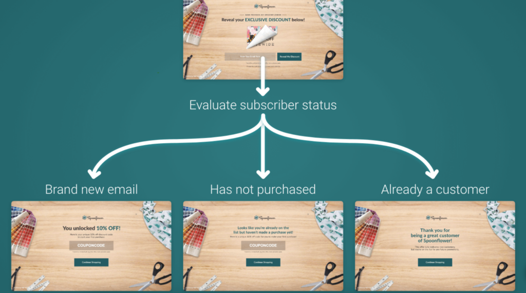
5. Segmentation
Let’s pop back over to our example of plant care and fish food for a moment. As previously mentioned, you’re not going to want to serve an ad about fish food to someone who came to your website to read an article about taking care of plants. You must set up campaigns to speak to your audience based on their behavior. If you have a sale on fish food and that’s the pop-up you want to serve, set it up so that it appears on the blog articles you’ve written about low-maintenance house pets.
Not only do you need to speak to website visitors based on their current behavior, but also make sure you understand their previous behavior. For example, segment out your website visitors who are already customers or newsletter subscribers, so you don’t continue to ask them to sign up for your newsletter each time they return to your website (and possibly give away more than you’re intending to!)
6. Persistence is key
There is a fine line between being persistent and annoying, and it is important not to cross it. Try to limit the number of pop-ups you serve visitors and use conditional elements. For example, setup campaigns that fire a pop-up on exit intent, and if the visitor doesn’t opt-in but continues to browse after closing the pop-up, give them a non-intrusive bottom bar on the screen. This way they can browse, and opt-in when they’re ready.
Keep your audience and their behavior in mind when deciding to re-engage with them. Maybe it’s after a certain period of time, or after they have visited a specific number of pages on the website.
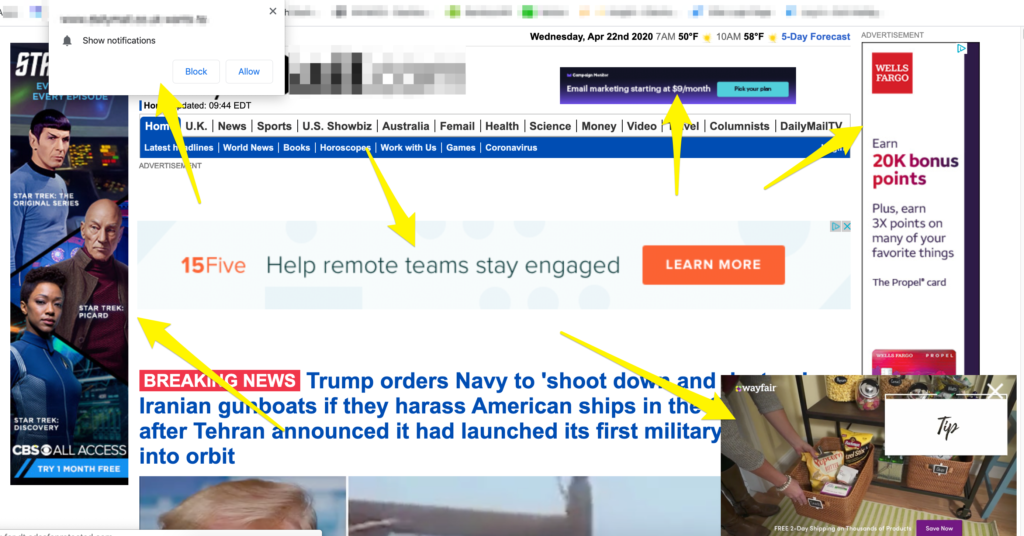
Here is an example of a website that crossed the line from persistent into annoying…
7. Relentless optimization
Set a schedule for yourself to optimize your email acquisition strategy at least every other week. You’ll be shocked at how much you can increase your conversion rates by continuing to get to know your audience through effective A/B Testing and optimization.
As every site is different, so is the audience viewing it. Ask yourself questions about your company: are you selling something expensive or just content? Are you a well-known brand or do you need to build trust before anyone will trust you with their information? What truly resonates with your audience? Continue to dig deeper and challenge yourself to spend the time it takes to think it through. Then, create something that will truly resonate with your audience. Don’t just guess, spend the time and do the research to figure out what works for your viewers.
Bonus Tip
Effective pop-ups will not happen overnight. Plan out your time to get it all done well, or consider an email opt-in agency that specializes in email capture to do it for you, like Exit Intelligence. We’re happy to strategize with you on your current campaigns or help you decide if it would be a good fit.
Unlock Growth through Customer Acquisition
Ready to work with a team of experts to unlock growth through customer acquisition?