


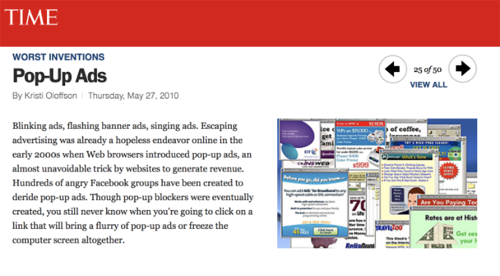
In 2010, Time Magazine ranked the Top 50 Worst Inventions of All Time. Some notables: lead gasoline, spam email, and the vibrating ab belt (don’t ask).
Coming in at #25th – WORSE than lead gasoline – is Popup Ads 🎉
What makes people hate Popups?
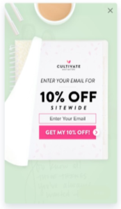
Take a look at the ad below. Purple has 2.3 million website visitors. Real people saw this ad… Every. Single. Month. How does it make you feel?

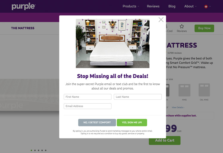
Annoyed, right? Not only do I trust them less, but:
- Where should my eyes look?
- All the deals? What deals? Why should I trust you?
- There’s a heap of fine print at the bottom and I don’t have my readers on me, nor should I have to
- You want my first name, last name, and email address? We just met! Give me some privacy!
I can only imagine what it looked like on mobile… Purple has since upgraded their ads – good for you.
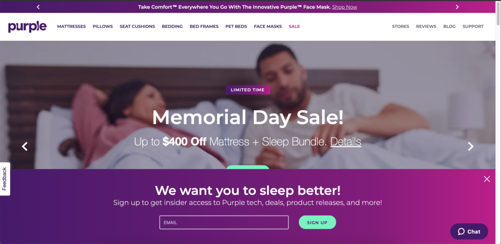
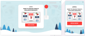
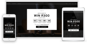
Now, how do you feel about this one?

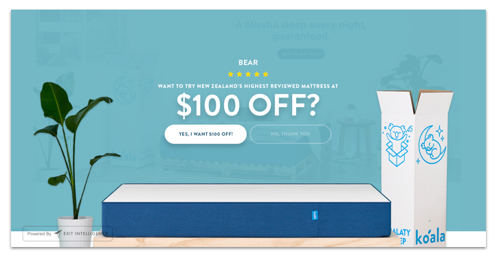
I might click “No, thank you”, but I’m not annoyed.
- My eyes know where to look – you’re offering $100 off this mattress
- There’s less than 1/3 of the text the previous ad had
- I only have to decide “Yes” or “no” with a click
- And most of all, it’s pretty. It feels nice.
Average vs. Nice
There is a massive difference in ROI between “Average Pop-Ups” and “Nice Pop-Ups”… in this case, conservatively over 200k emails per month are on the line. See the table below:

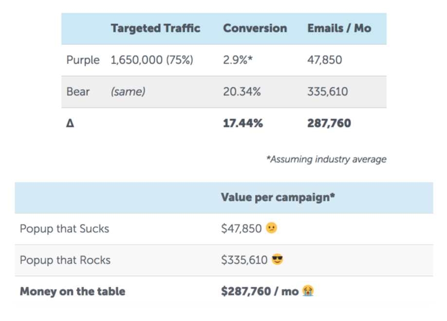
*Assuming a value of $1 / email (a low estimate)
What are typical conversion rates?
Conversion rates vary by industry and brand. Companies don’t typically publish their data, but we can extrapolate a general baseline.
Here are conversion metrics from 500,000 sites using a Pop-Up tool from Sumo. These numbers mirror what we see from the hundreds of e-commerce sites that come to us with 30k – 10M uniques / mo.
![]()
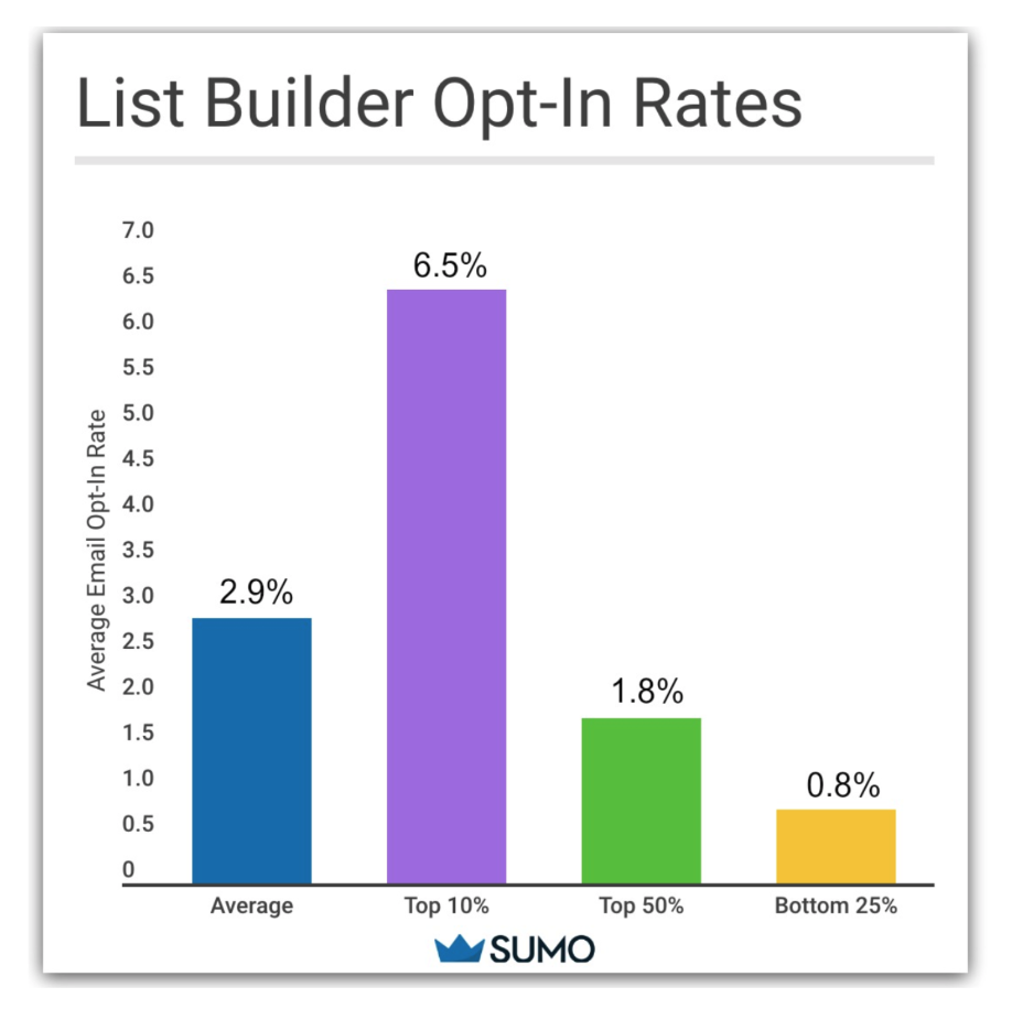
Sumo is a great tool, but 99% of sites with Pop-Ups are doing a Pop-Up for the first, second, or maaaybe third(ieth) time. When you make thousands, you come up with a formula.
Our average client has an 11.5% opt-in rate. Our top 10% regularly average over 20% opt-in. That’s roughly 3x as many emails. Which begs the question… how exactly can you do that?
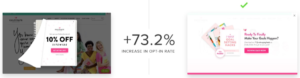
Pop-ups that don’t suck can be beautiful: 21.86% Opt In

They can be classy and clean: 15.2% Mobile Opt In

And they can make everyone money:

Up Next: The Checklist we use for every poppin’ Pop-Up we make.
1. Design

A Pop-up is the web equivalent of a retail salesperson at the front of your store that talks with people as they enter and leave. It pays to be snazzily dressed and to the point. In a web context, that means keeping your design minimal, clean, and on brand.
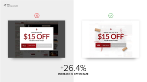
If you have the luxury of A/B testing, subtle design changes can have a huge impact on conversion. Less is often more.
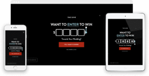
2. The Gift
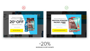
In the picture below, which call to action -“Stop Missing All the Deals!” or “$100 Off” – grabs your attention more? Obviously #2! Users should be able to answer the question “What’s in it for me?” in a split second. You know your users… what will grab their attention?
Often, A/B testing your gift can increase conversion substantially. For an AOV of $100, that could be testing response to 20% off vs. $20 off. In the test below, the free item took the cake and actually cost less money to our client.

Types of gifts:
- Percentage off
- Dollar amount off
- Free shipping
- Gift with purchase
- Entering a contest
- Many more
3. The Ask
Have you seen forms like this? This company is asking for your first and last name, phone number, email address, and for you to type out how they can help you. I’d take one look at this form and ‘nope’ out of there.

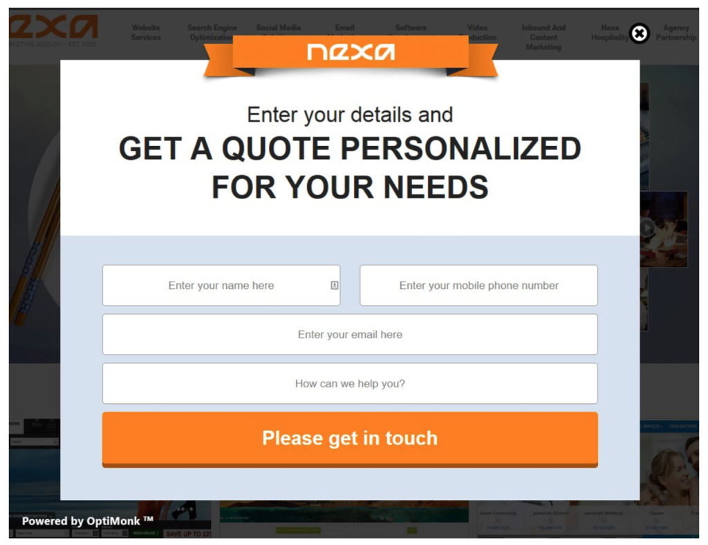
**Make it easy for your user to say yes**
Staring with a “yes” or “no” question will increase conversion for your second, larger ask (often, the email). This is known as the “foot-in-the-door” effect and stems from a study out of Stanford University.
The Foot In The Door Effect
It’s 1966 and two Stanford psychologists telephone housewives in California. They split their calls into two groups, much like an A/B test. In both groups, the experimenter says they are calling from the California Consumers Group about a public service guide they’re making…
Group A
“Could we send five or six men to do a 2-hour inventory of your cupboards?”
–> 22% Conversion <–
Group B
“Would you answer a few questions about the household products you use? It will only take a minute.”
Three days later… “Could we send five or six men to do a 2-hour inventory of your cupboards?”
–> 52% Conversion <–
The ask eventual ask was just as ludicrous both times, but the second approach was more than twice as effective! The psychology behind the “Foot In The Door” effect has been proven in many contemporary studies as well.
The Takeaway? Preface large asks with a smaller, easier one. Online, ask a user to say “yes” or “no” (the smallest ask possible) before asking for their email (a more personal ask).
You can get nerdy with the whole Stanford Study here.
4. Mobile First

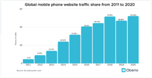
If Mobile isn’t already more than half of your traffic, it will be soon. As of March 2020, 52.03 percent of the overall web traffic comes through mobile phone (Oberlo).
If Mobile is your main channel, how much effort do you spend optimizing for it?
We always design with mobile in mind and run campaigns that are seamless across devices. You should be doing that, too! The effects on email capture are monumental when mobile is over half of your traffic!

When do I trigger a Pop-Up on mobile?
Here are two low hanging fruit:
- Trigger by Scroll Position: When a user reaches a certain part of the page
- Trigger after Inactivity: When a user is inactive for a certain period of time – less than your average time on site for bouncing mobile visitors, for example
5. Timing & Targeting
There are countless ways to trigger and time your Pop-Up Campaigns. With all the options, how do you choose what to do for your campaigns?
Exit Intent
The average eCommerce bounce rate is ~ 60% (Compass). That means means over half of site visitors leave after viewing just one page. When we ask “where should we target to get the most ROI?”, bouncing visitors is a good place to start.
A Pop-Up on exit – also known as “Exit Intent” – is a second chance to engage a bouncing visitor, usually by capturing their email. A well-done Exit intent Pop-Up can easily capture 8-25% of users emails.
Here’s a quick video illustrating Exit Intent:
Already got Exit Intent, what’s next?
Offer discounts to risky high value carts. Lets say someone adds a large item to their cart and exhibits a few characteristics to show you that they have intent to buy (previous purchases, time on site, etc).
They go inactive for 1-minute… Uh oh! Danger Zone. A clean Pop-Up with a discount directly addressing their situation can increase conversions.

Timing options:
- On page load
- On page delay
- On exit
- On stop scrolling (delay)
- On inactivity (useful on mobile)
- Manual (opened by something else)
- Scrolling to a specific element (scroll percentage, bottom of page)
- On button click
Targeting options:
- Cart value
- Specific Ad Campaign – for example, offering the same Ad Campaign that a user clicked on Facebook
- Any demographic or user data
6. Pzaz

Pzaz is like confetti. It’s not absolutely necessary, but it can definitely help your Pop-Up party.
We’ll cover four types:
- Social Proof
- Urgency
- Suspense
- Animations
Social Proof
Have you been featured by an organization or person your customers love? Do you have a respectable number of followers on a social platform? Reviews on google?
Put those hard earned logos, celebrities, followers, and reviews up!


Suspense (aka. Reveals)
Reveals are a fun and effective way to add suspenseful spice to a normal discount.


Sense of Urgency
Adding timers, limited contests, coupons, etc can often have a positive effect on conversion.

Animations
Isn’t this fun? Don’t you want to engage with this?
7. Metrics & A/B Testing
Want clarity on where to invest your money and time (or on which design, gift, etc is empirically best)? With a tool and some quick math, it’s relatively easy for your business to answer questions like:
- How valuable is my email list?
- What’s the ROI of my campaigns (email, Pop-Up, etc)?
Here’s an example from Exit Intelligence:

Concrete numbers can guide your decision making and save you time. We’ll show you how to calculate LTV of an email subscriber in the next chapter.
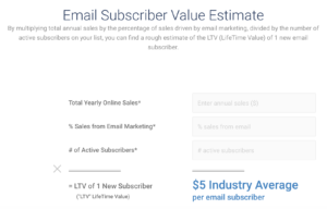
Get a Value for Your Email Subscribers
Email Subscriber Value (ESV) is a more important metric than your opt-in rate or your unsubscribe rate. Why? It answers two fundamental questions for your business:
- How much do I make when I get an email? (Email Subscriber Value)
- How much time and money should I invest in getting emails?
Grab your canvas of choice (a napkin, sticky note, spreadsheet, etc.) and your writing utensil of choice (pen, crayon, furiously fast fingers, etc), and let’s calculate your ESV in 5-minutes.
1. Count Real subscribers
Lookup your current total subscribers in your ESP. Alas, not all subscribers are created equal. Clean out anyone that’s inactive. We like to clean out all subscribers who haven’t received an email in the past 3-months.

2. Attribute revenue to the list
Track Revenue with your ESP
Most ESPs auto-magically track revenue attribution to emails (like the picture above from Klaviyo). It’s in their best interest to show you how much money their tool makes you 🙂
If you don’t have revenue tracking setup, here’s Official Guides for Bronto, Klaviyo, Mailchimp, and Google Analytics. Once you have revenue tracking setup, you can see exactly how valuable your email marketing efforts are on a granular level. That’s GOLD!
What revenue do I count?
People like to talk about two types of revenue:
- Direct revenue, or sales that come through a list. Ie. dwainetherockjohnson@gmail.com gets an email with a 20% off sale, clicks through, and buys a set of autumn scented candles.
- Indirect revenue, or indirect brand value you gain from content pieces, etc.
Direct Revenue is cleaner, thus, we usually just look at direct revenue.
What date range should we look at?
Our most market savvy clients use a timescale that fits their sales and customer lifecycle. If customers purchase once a year, use a yearly timescale. LTV (life time value) is the holy grail, but often hard to calculate. 12-months seems to be a good middle ground.
3. Subtract Costs for Profit Per Subscriber
Sending email ain’t free! If the costs to maintain your email list are readily available, subtract them. Add in time from your team as well if that’s easy to calculate. Don’t let perfect be the enemy of good. Make napkin numbers with the data you have readily available. You can improve on it later.

Here are three common costs:
- Email Service Provider (Mailchimp, Bronto, Klaviyo, etc.)
- Ad Spend
- Time (designer, email template developer, copywriter, etc.)
And… Voilà!
You now know how much your emails are worth, how much you’ll make when you get a new email, and how much it makes sense to spend to get a new email.
Money on the Table
The essence of A/B testing is continuous improvement. It takes work, so if your business doesn’t quite have the traffic or doesn’t invest heavily in email marketing, a simple Pop-Up might serve you best.
But, if you have more than 30k visits a month, A/B testing can easily represent a 20-30% increase in the number of emails you collect a month. When your traffic is in the 100k – 10M range, that 20-30% can equal hundreds of thousands of emails a year.
1. Pick ONE thing to test
Here is where you leverage the good old scientific method to continually improve. Pick one variable to test at a time, otherwise, you won’t be able to connect changes in your opt-in rate to a specific change you made in your strategy.
 (Tested copy, then tested marquee vs. full screen)
You can test…
- Design (especially making the design cleaner)
- Gifts
- CTAs
- Asks
- Timing
- Target Audience
“But, Matt, what do I test first?”
Option #1: Clean up your design
The lowest hanging fruit we often see is businesses coming to us with busy Pop-Ups and / or Pop-Ups without a clear and compelling CTA.
Ask yourself, what are all the words we could cut out of this and have it still make sense? How might we add more empty space so our users’ eyes go directly to that nice gift we’re offering them? How might we make that gift especially compelling?
If your design is clean and your conversion rate is especially low, A/B test your gift. Your gift might not be connecting with your audience.
Option #2: Go with Your Gut
Cleaned up your design and want to test more? You’ve been in this business for a while. You (hopefully) know your customers by now. What do you think has the biggest upside to test? Try it. The great thing about collecting data immediately is that you’ll know in a week or two if your hunch was accurate. Many times it will be (and sometimes it won’t).
Option #3: Go To Your Users
If you’re not proactively prototyping designs with users, it will immediately level up your game. Show your design – it could even be on a napkin – to three people in your target demographic and ask them to, “Can you use this as if it were real and talk me through what’s going on in your head?”
If you’re not familiar with user centered design, this might sound goofy. It’s not. It’s industry standard in Silicon Valley for good reason. You’ll arrive at a product that achieves your goals much faster with quick feedback directly from your user than if you try to create it in isolation.
Here’s an example script you can use:
You: “Hey, Jim, we’re testing a new feature on our site, and I’d love your perspective. It will only take 3-minutes.”
Jim: “Oh, thanks. Sure.”
You: “Where do you usually shop?”
Jim: “Mostly at the office after lunch when my boss has gone out. I just got the new iPhone. I shop on that when I’m bored.”
You: “Great. Imagine you’re at your office on your phone shopping… a colleague starts chatting you up. You look back on your screen and this is there. What’s going on in your head?”
Jim: “Mmmm, ok. Well, I usually hate mobile ads, but this one at least looks nice. $25 off? I’d do that. But I didn’t read that $25 off at first. I read this other part…”
You: “Wait, what?” (You start to write furiously in a notebook…)
2. Make TWO designs
This is pretty straightforward. Change one thing about your design in each version and use a program like Optimizely to serve each to a statistically significant sample.

(tested discount vs. free download)
3. Iterate
Once you gather enough eyeballs, check your results! Most of the time, one test will win. Sometimes, the difference in the two campaigns will be negligible.
In either case, you’re shooting for conversion in the 6-20% range, and if you’re not there yet, keep A/B testing. With each test, you’re learning not only what works, but what your unique users respond to most.

(Tested design, then CTA)
A final note on industry best practices
Like any industry, best practices and regulations evolve. For example, in late 2017, Google started dinging SEO rankings for poorly designed mobile ads. Many companies didn’t even know this was the case and saw their rankings decline.
Make sure someone on your team is keeping up to date with industry best standards so you can be ahead of new standards and industry features – not behind them.
That’s all, folks! I hope this has been helpful.
If you see any ways to improve this guide, shoot me an email at matt@exitintel.com.